
Some stock charting services try to cram way too much information on their charts which leave you overwhelmed. You’ll find MarketSmith India charts clean and simple, featuring all the key indicators you need to review your stocks – without the clutter that tends to create more confusion than clarity.
Key features on MarketSmith India Charts and why they are important to investors:
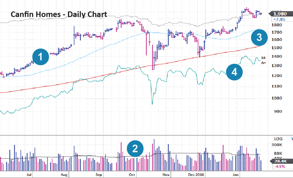
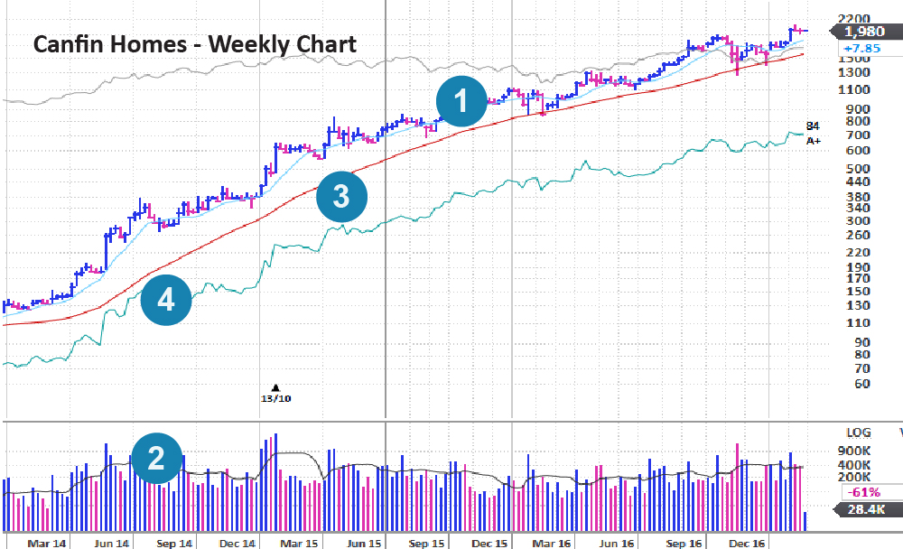
1. Price: The price area shows daily changes in the price. The vertical bars in the price area of the daily chart show the share price range for that day. The small intersecting horizontal dash within the price bar indicates the current price or where a stock closed at the end of the day. The colour of the price bar represents whether the stock closed up (blue) for the day or down (red) for the day.
2. Volume Bars: The vertical bars in the volume area indicate the volume (i.e., number of shares traded) that day. As with the price bars, the color of the volume bar represents whether the stock closed up (blue) for the day or down (red) for the day. In the volume area, the red line shows the average volume for that stock over the last 50 days.
3.Moving average lines: This horizontal red line tracks the average share price over the last 200 days of trading. This horizontal blue line tracks the average share price over the last 50 days of trading.
4. Relative Strength line: This line compares the price movement of that particular stock to the price movement of the BSE Sensex (which is often used to represent the overall market). If the line is trending up, the stock is outperforming the market. If the relative strength line is trending down, it tells you the stock is lagging the overall market.
Important: Be sure to use both daily and weekly charts.
The weekly chart helps you see longer-term trends. Daily chart helps you spot specific buy and sell signals while daily price fluctuations in perspective. Using the daily and weekly charts together helps you distinguish between normal price changes and a true shift in trend. That will prove invaluable when it comes to both pinpointing the best time to buy – and deciding if it’s time to sell or just sit tight. (Learn more in the sections on Buying and Selling.)
Get Quick Snapshot of Price & Volume Changes
Just click inside the price area on a daily or weekly chart to pull up a data box like the one shown in the screenshot below. You’ll find the latest price and volume information, including:
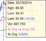
- High and low price for day or week selected
- Most recent price
- Price change for the day or week selected (in Rupees and percentage)
- Volume (i.e./ number of shares traded) for the day or week selected
- Volume % Change: Shows how far above or below average the volume is the day or week selected